
In Focus: Balance Bound Co
I initially learned about Brooke and Terry’s work (Curious and Co) when they redesigned the logo for my friend Sarah Bourne Rafferty of Atwater Designs. As a branding company they focus on creating clear brand identities that communicate well - while also looking so dang good.
When they created and released their 2020 Balance Bound Planner, I swiftly grabbed one for myself. I love a good planner and even though 2020 wasn’t going at all how I had planned, the planner still kept me in line and I was able to get so much done.
Balance Bound is also dedicated to long term self-care for individuals. This includes actively working towards anti-racism in their messaging and lives.
“Self-care is not all manicures and spa days. It is the ongoing process of how you pay attention to and care for yourself in a world obsessed with hustle, so you can show up more balanced, rested, and whole… for yourself, your family, and society. For many marginalized and oppressed individuals, self-care is a necessity for survival — and for those of us more privileged, self-care is an incredibly important tool in caring for ourselves so we can be better allies and activists for those who continue to fight daily for equal rights.”
The problem and our solution.
The pre-made mockups were great for the first run but Brooke wanted the new imagery to align with their vision for the Balance Bound Planner. A non-stuffy kind of planner that fits into every aspect of your life/work and easily keeps you on track with your goals, whatever they may be.
We agreed that multiple lifestyle images would be key in solving this problem, as well as some detailed images of the planner itself. My goal was to create scenes that easily fit into their visual home that was already created but with more finesse and purpose.
Friends, I loved this project so much.


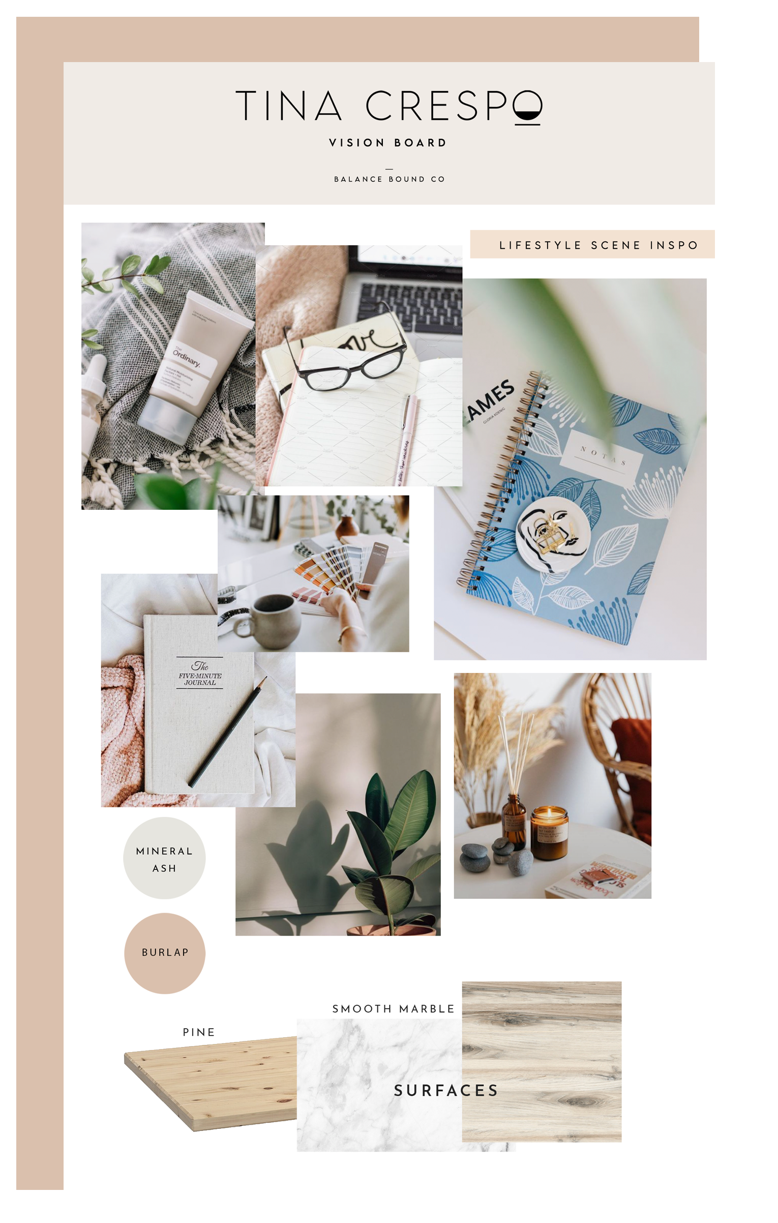
The Vision Board
The vision board I created for this project purposely had little color in it. The planners were going to be available in multiple colors and designs, it was important that the scenes created did not overpower them with lots of color.
Painted backgrounds using colors like mineral ash and burlap (both Benjamin Moore) were used for flatlay photography, and of course, I had to throw in some Replica Surfaces (specifically marble).

The final imagery succeeded in creating a visual home for Balance Bound Planner, and Brooke reports that since they began using the new images they have seen a surge in social engagement and sales. That’s what I like to hear! Thank you for entrusting me with this project.
Follow and shop from Balance Bound: Balance Bound Co. Instagram: Balance Bound
Hire Brooke + Terry for Branding and Design: Curious and Co Instagram: Curious and Co